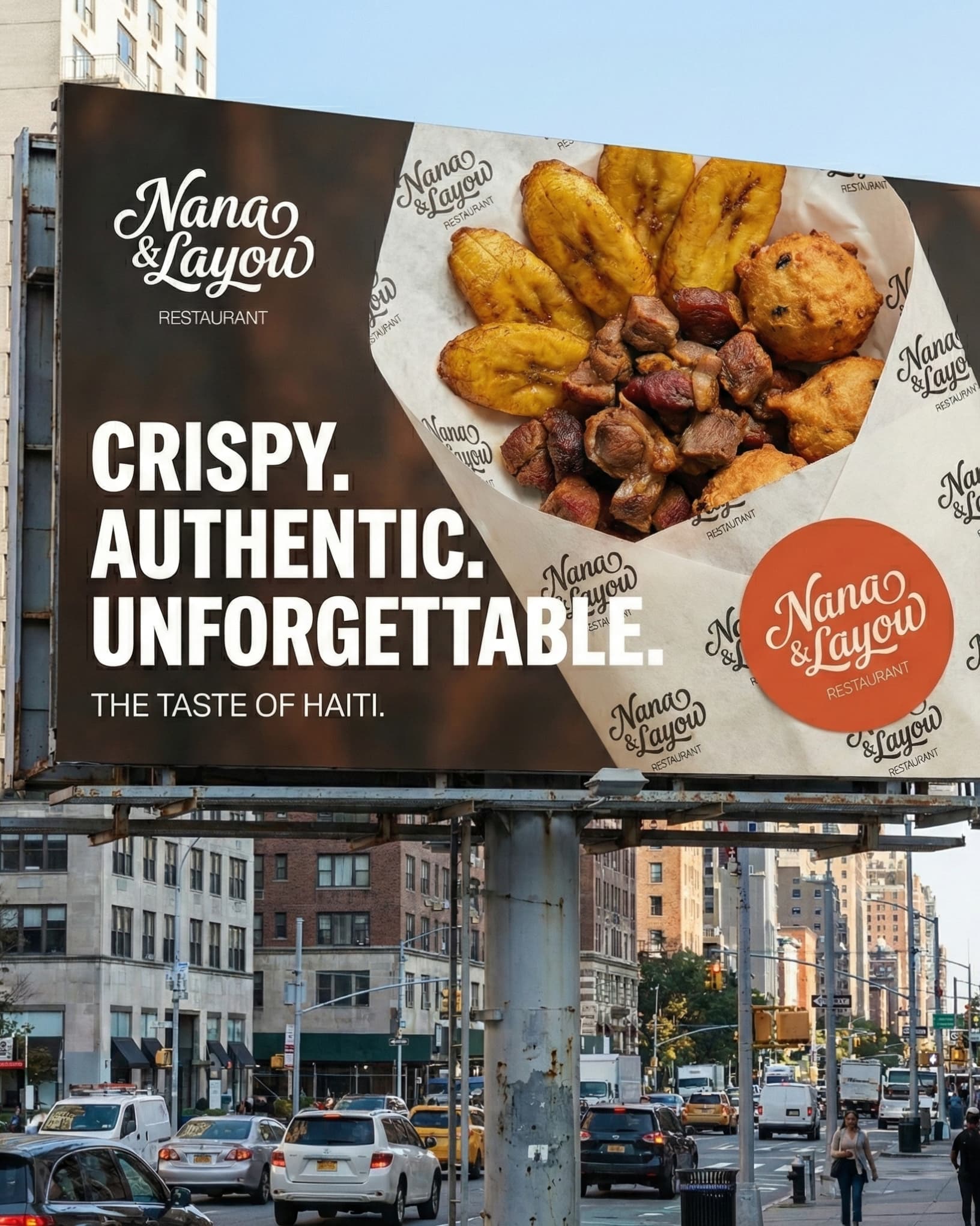
Branding
Cine 1962
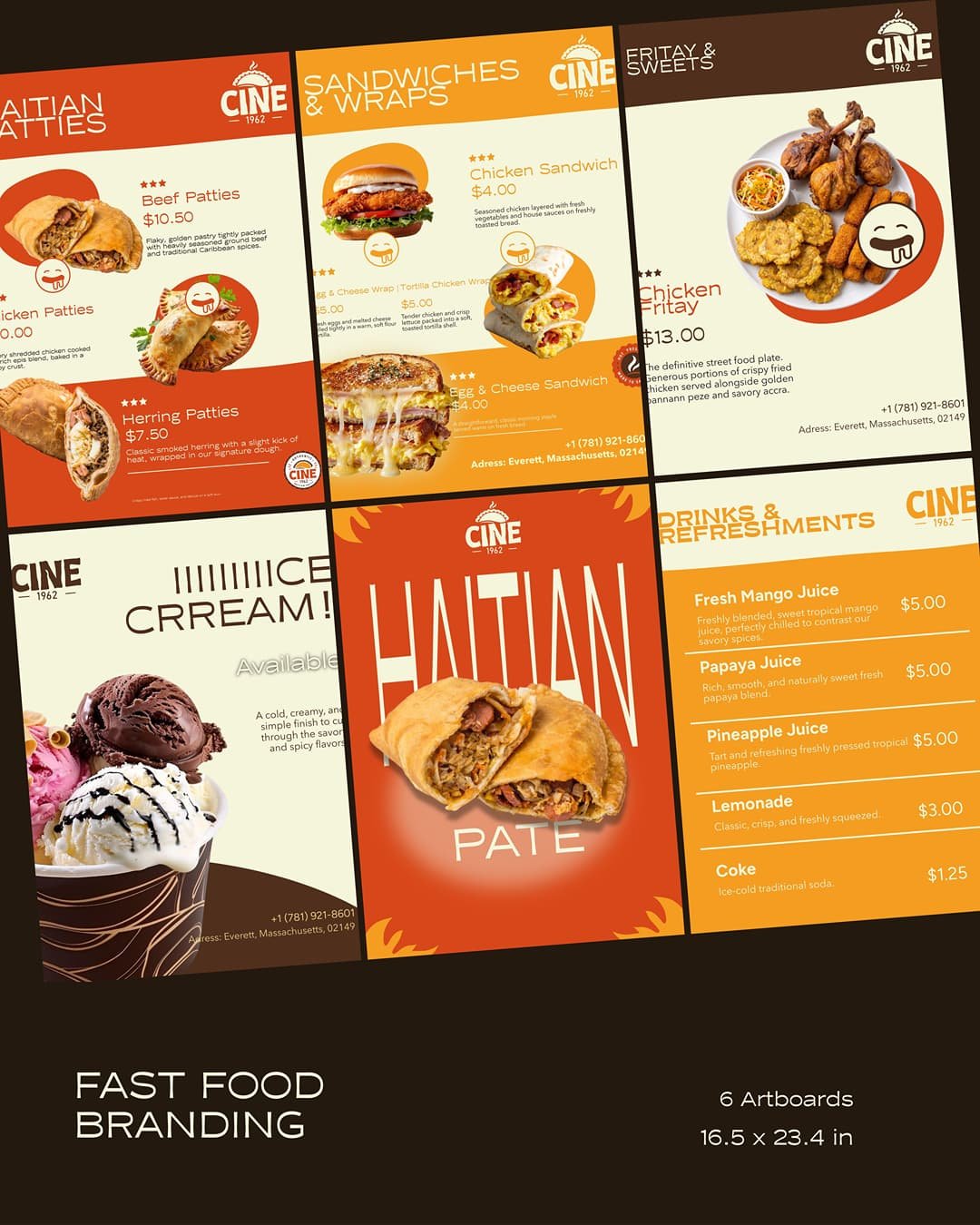
Building the visual identity for CINE 1962 was a distinct challenge, starting right out of the gate with the name. How do you design for a brand called "CINE" when it has absolutely zero connection to cinema?
The answer was to completely anchor the identity in the product and the heritage. CINE 1962 is purely authentic Haitian street food; pate, fritay, and bannann peze. The goal was to dismantle the "messy street food" stereotype and elevate it into a premium, hygienic space without losing its cultural soul.
I built a strict color architecture: a matte Deep Coal base to create a luxurious backdrop, warm Off-White for clean typography, and Saffron-Gold accents to make the warm, crispy food photography jump off the packaging. Nostalgic 1962 energy, but executed with modern, high-contrast structural precision.
#branding #foodbranding #visualidentity
Create a complete visual Identity for a street food seller
Redefine the Brand Narrative: Overcome the cognitive disconnect of the name "CINE" by anchoring the visual identity so heavily in the product that it immediately communicates authentic Haitian street food rather than cinema.
Establish a Strict Color Architecture: Deploy a high-contrast 60/30/10 color system (Deep Coal, Warm Off-White, Saffron-Gold) to create a matte, luxurious canvas that forces the golden, crispy tones of the fried food to serve as the primary focal point.
Design a Scalable Commercial Ecosystem: Build a comprehensive, tangible suite of assets—spanning custom greaseproof paper, physical packaging, street carts, and menu boards—that maintains strict visual consistency across all physical and digital touchpoints.
11 images
Learn
Explore