Branding
Nana & Layou
Industry
Branding
Year
2026
Duration
6 days

Nana & Layou © Visual Identity
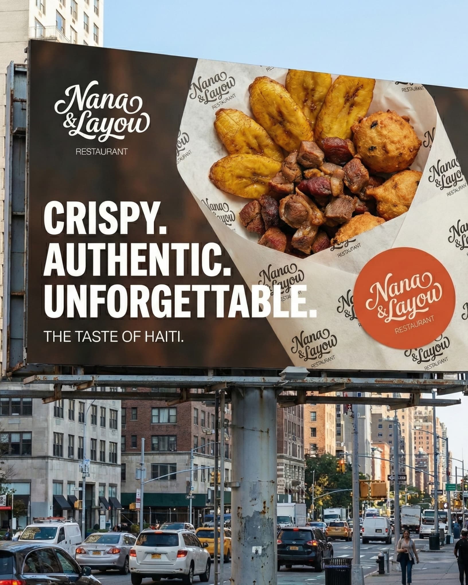
For Nana & Layou, the challenge was clear: How do we take the raw, authentic energy of traditional street food—Paté Kòde, Fritay, and Wings—and elevate it into a scalable, high-end visual identity?
We moved away from the generic "neighborhood snack" look. Instead, we built a system based on:
• The Palette: Deep Charcoal for a premium feel, accented by Burnt Orange and Saffron to evoke the heat of the fryer.
• The Strategy: A 60-30-10 color hierarchy that ensures the brand feels sophisticated, not cluttered.
• The Result: A visual language that justifies a premium price point while keeping its cultural soul.
The Art of Gourmet Street-Food !!
6 images
Learn
Explore